

History of our logo
IN THE BEGINNING
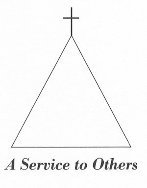
The original logo was a simple creation to denote the core principal of the ministry: God and the Trinity. This logo’s triangle symbolizes the Holy Trinity – Father, Son and Holy Spirit – which is the core of Christian belief. Atop of the triangle is the cross, which in itself is symbolic with the horizontal cross beam stretching across the timeline of humanity and the vertical upright connecting humanity with the divinity of God. The words under the logo, A Service to Others, reflected the reason for the ministry’s creation and existence.
A NEW CREATION FOR THE CAPITAL CAMPAIGN
In the early 2000s, it was clearly evident that we had outgrown the building that housed its operations and a new building was desperately needed. During the building campaign Tim Elliott of Elliott Designs, was contacted to help with artwork and a new logo. Taking the triangle and Cross into consideration, Tim created a new logo, the first with color, to represent the ministry.
In the center of the logo is the Cross, the strength and center of our ministry. The ecclesiastical color of green provides a foundation and in the center are concentric circles that represent the churches of our community, both large and small, and individuals who stand ready to help neighbors in need. This is also symbolic of Fresnel lens of a lighthouse, as our ministry serves as a circle of light to those in need. Finally, spelling out the entire name, Eastern Catawba Cooperative Christian Ministry was desired to communicate to the community who we are, as awareness campaigns were underway for a major building campaign.

THE FAITH OF FIFTY YEARS
On the dawn of its 50th Anniversary, Tim Elliott was once again contacted to help update our logo for its fiftieth year. Tim’s task was simple: combine all the important elements of past logos, honoring the integrity of his work fourteen years earlier, for a modern update to carry into our future.
The Hands in Need logo, developed by Tim Elliott of Elliott Designs in Newton incorporates two elements from our previous insignia:
The cross, which emphasizes our Christian mission, centered on Christ and guided by the Holy Spirit.
The waves of circles, inspired by the Fresnel lens of a lighthouse, symbolize our ministry as a beacon to those in crisis.
The concentric circles represent the churches of our community, both large and small, and individuals who stand ready to help neighbors in need.
The larger hand, reaching up, symbolizes the Hand of God, embracing all of humanity, and further symbolizes the hand up that we seek to provide to those in need.
The smaller hand, reaching out, is the hand of the one in need.
The cross, which symbolizes the core of our ministry and our foundation in God.
Hands are important: As humanity reaches out, God is there to receive. Humanity reaches to God through the Cross. As depicted in the logo, one cannot approach God without the cross. Abstractly, the circles become hands above and below–those who give, those who receive. The ecclesiastical color of green, harmonizes well with the blue, often used in Christian contexts to connote hope and good health.
The result, as portrayed by Elliott Design, is The Faith of Fifty Years.


A NEW NAME
The new ICON combines three essential elements. At the center is the cross that continues out into the world - a cross that directs and sends the ministry out into the world to serve all people in the name of Jesus.
It features the people of God circled in community, interdependent on each other for care and support. Each person reaches in and out as they are able at different times in their lives.
This represents those who benefit from the services and those who support them. Finally, it features a color palette that reflects growth and new life. The colors are intentionally chosen to create calm and comfort.